

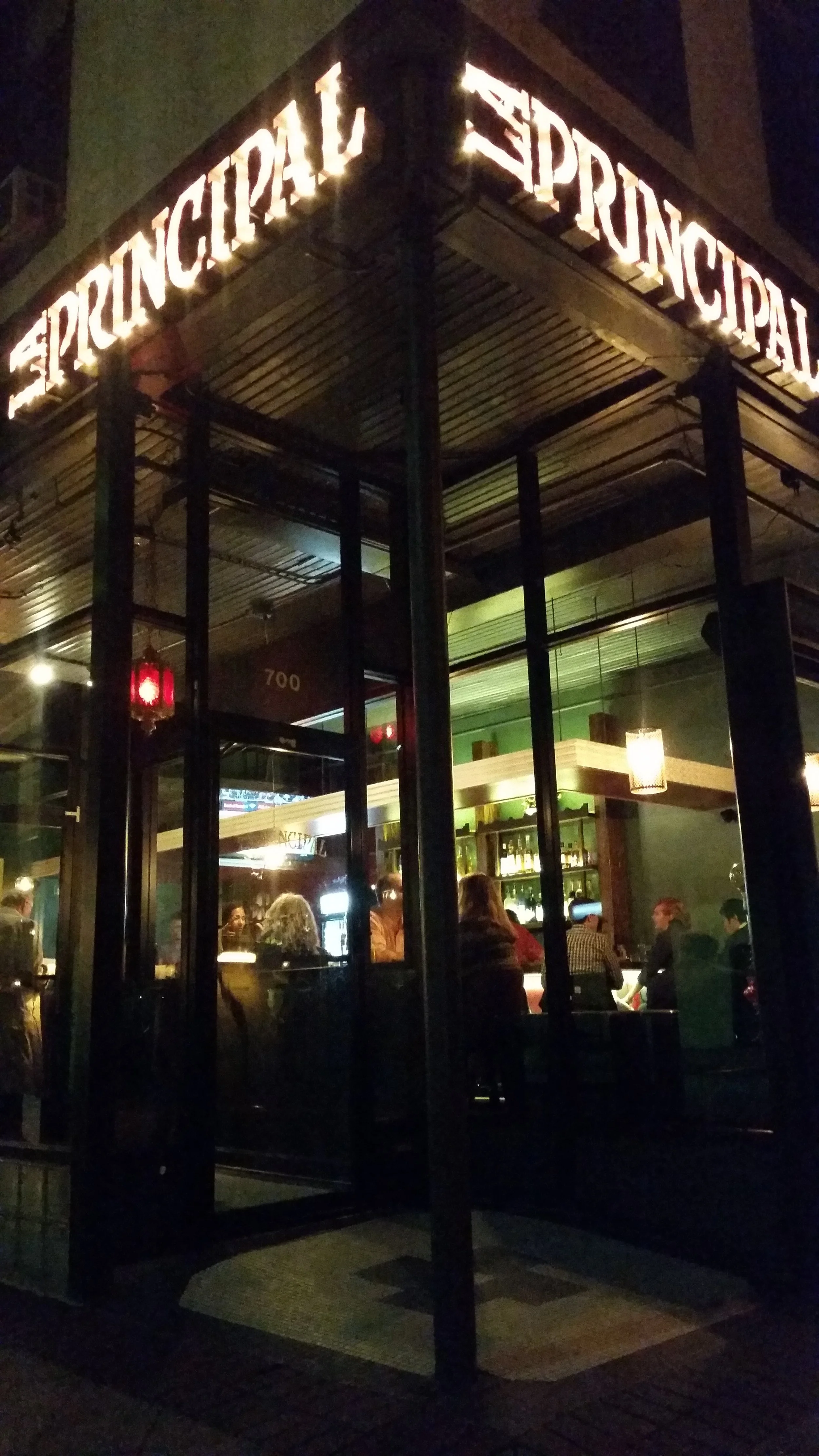


EVANSTON, IL
The owner of La Principal hired me to design the logo for his new restaurant with perhaps the funniest client direction to date: "Modern but a little rough – like, you won't see a knife fight there, but maybe you've been in one in the past." I also created the exterior signage layouts, designed the business cards, menu templates, and so on. I continue to design whatever collateral, marketing, and merchandising they think up.
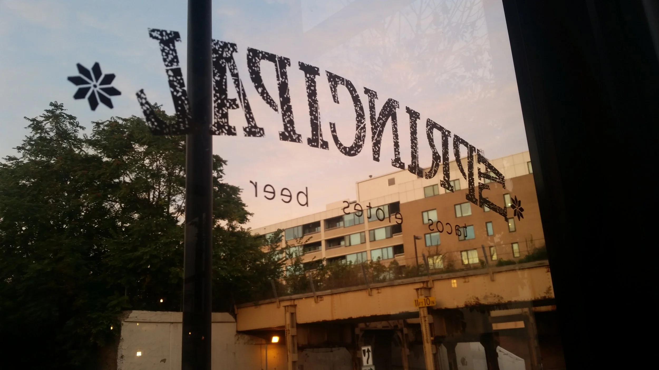
The signage for the windows was painted using vinyl templates.
loyalty cards for the coffee window
menus
Dessert menu card
catering menu
For the kick off of La Principal’s take out and delivery service, I suggested foregoing the planned direct mail postcard for a targeted tear-off menu note pad. I created these 10-page pads, which were dropped off at local businesses and co-working spaces.
The house hot sauce was instantly popular, so I created labels for retail bottles.
During the Covid lockdown, I created this logo to be used in the marketing campaign for curbside/delivery, and on delivery team wearables.