


PROJECT 1 of 5
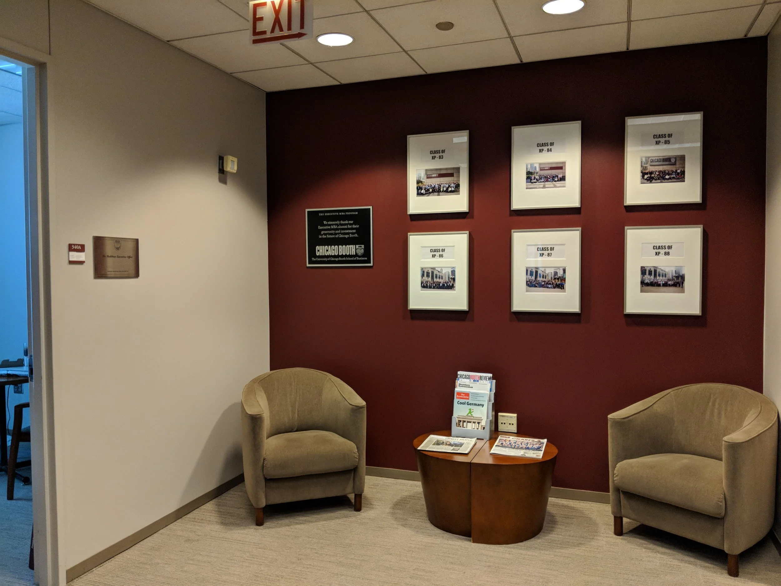
The Booth School’s Marketing department brought me in to redesign their downtown Chicago campus’ Executive MBA office at the Gleacher Center. I thought the space could better reflect their brand identity, as well as appear more polished and professional, thus speaking more directly to their audience of executives.
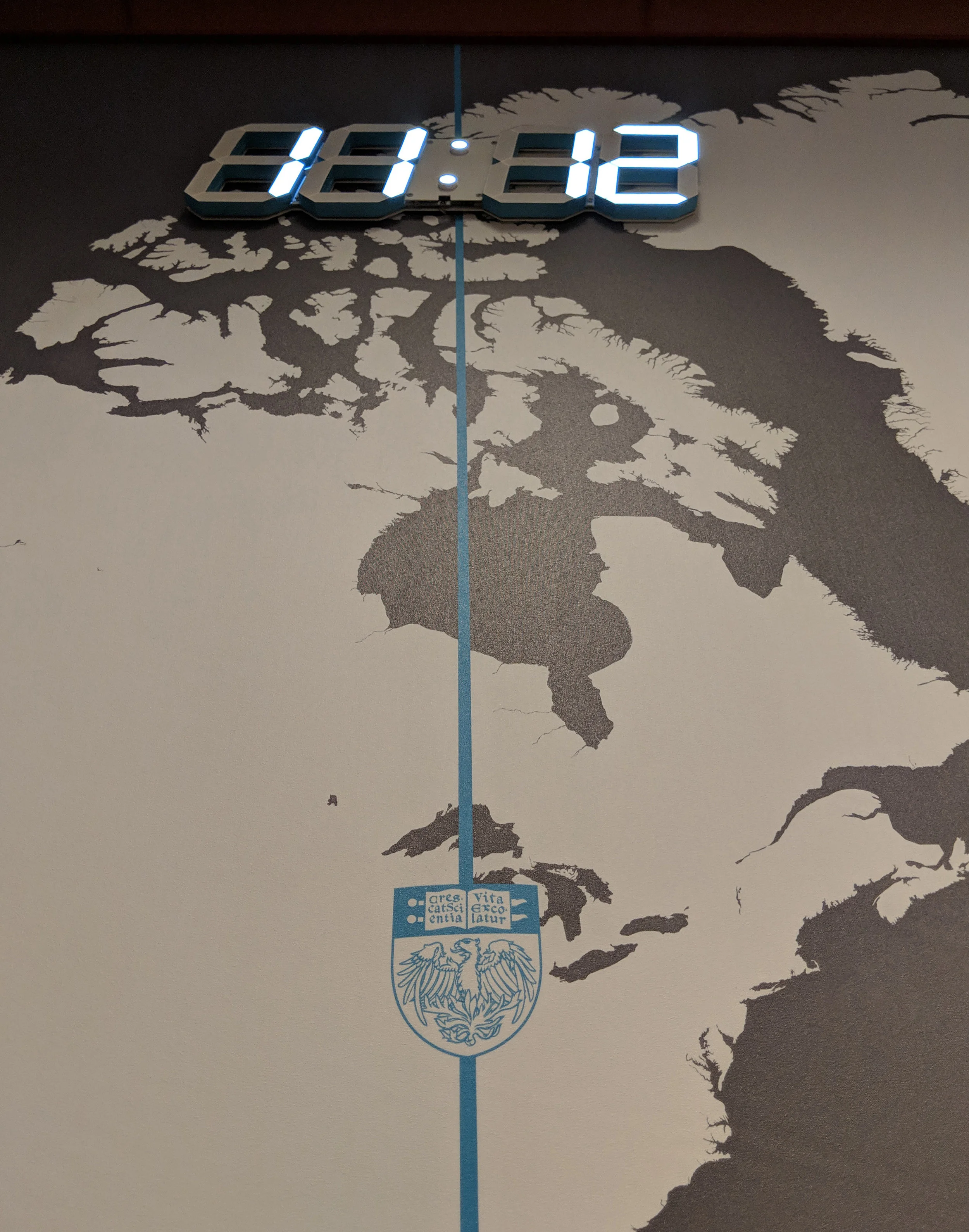
Of the programs at Booth, the EMBA is the one most focused on its global identity, so they were interested in keeping the local times of each of their 3 campuses in the reception area.
Adding the Maroon Ribbon—an element seen on all Booth printed material—as crown molding, along with the painted phoenix, the Booth grays, and touches of the 3 global campuses colors all serve to make the space branded as a Booth space. In addition, I used their 75th anniversary content detailing milestones of the Executive MBA program, and designed a timeline down the office hallway.
The EMBA Team decided they wanted the hallway timeline content to be culled down in order to leave space at the end for future entries. Instead of just leaving that wall segment blank, I used the Booth photo archives to create a large scale collage as a relevant placeholder.
PROJECT 2 of 5
The EMBA Team had me back a few months later to take a look at their kitchen, which doubles as a work space. Since this is ‘back of house’ space, we didn’t want to go crazy with the budget. But, I knew at the very least I could make much better use of the small room, and certainly make it better looking.
My primary goals were to create a Kitchen Side and Work Side of the room, get rid of the clutter, and add counter, all of which would yield a whole lot more work space, and help with the overall messy vibe.
First, the door swing moved to opening right rather than left, so a dead wall was covered rather than work space. I recommended the old copier be replaced with a new much smaller model, and relocate it to the far wall. This created space for a wall of new cabinetry and full length counter on the Work Side of the room. I left space under that counter for a set of rolling files that were taking up closets around the office. Nearly everything in the room was moved inside cabinets (e.g., paper, coffee), under counters (e.g., microwave, garbage/recycling bins), or on the wall (e.g., small office supplies). A dishwasher was added to the appliance package for both convenience, and to keep the counter clear of drying dishes. Cables, electrical and water lines went through counters to keep them from view.
The other element to address in this room was the color / brightness. I changed out the old dark cabinets doors and counter on the Kitchen side for bright replacements, then used the same materials for the new Work Side. I had the walls painted Booth gray, above the cabinets Booth Maroon, and a couple details painted Chicago Campus Blue for a punch of color. What a difference!
PROJECT 3 of 4
The brand new shared suite at the Hyde Park Campus for the Polsky Center for Entrepreneurship and Innovation and the Rustandy Center for Social Sector Innovation was a lovely blank slate needing some color and branding.
For this first phase, I added a handful of elements to the suite entry to give the space some life and brand identity.
The wallpaper behind reception is made of a pattern I created from the Polsky logo, in shades of the Booth maroon, with dimensional letters using the word describing both Centers and the brackets from the Rustandy logo.
This wall in the center or the entry space was perfect to feature the story of both the Polsky and Rustandy Centers. I kept the imagery and graphics separate not only to create a dynamic array, but allow flexibility to swap out any for updated imagery.
This sitting area needed to have something break up the glass visually both to make it less of a fish bowl, and for safety so no one would walk into it. The Booth Phoenix is a perfect graphic to fill those roles.